Designing a magazine spread in Adobe InDesign requires understanding both the software’s technical tools and the fundamental principles of layout composition. A magazine spread is a two-page view that readers see simultaneously when they open a publication, and designing for this format means thinking of it as a unified visual space rather than two separate pages. InDesign, Adobe’s professional layout software, provides all the necessary tools—master pages, guides, text frames, and image placement options—to create spreads that are visually cohesive, readable, and compelling. The process involves setting up proper document dimensions, establishing a grid system, managing typography across both pages, and integrating images in a way that guides the reader’s eye naturally across the entire spread.
For example, a typical magazine spread for a technology publication might feature a headline spanning both pages, a high-impact hero image on the right page, and supporting article text on the left, all unified by a consistent color scheme and type hierarchy. The key difference between web design and print magazine design is that web pages scroll vertically while magazines present content in fixed, two-page units that are viewed simultaneously. This fundamental difference shapes how you approach spacing, image placement, and text flow. Understanding these principles will help you create professional spreads that work whether you’re designing a client’s print material, creating PDFs for marketing campaigns, or building templates for ongoing publication work.
Table of Contents
- What Are the Essential Setup Steps for Creating a Magazine Spread Template in InDesign?
- How Should Typography Be Managed Across a Two-Page Spread?
- What Are the Best Practices for Placing and Scaling Images in Magazine Spreads?
- How Do You Establish Visual Hierarchy and Balance Across a Two-Page Spread?
- What Common Technical Issues Arise When Designing Magazine Spreads, and How Do You Prevent Them?
- How Should You Handle Text Wrapping and Runarounds for Magazine Layouts?
- What Emerging Trends and Future Directions Should Magazine Designers Consider?
- Conclusion
- Frequently Asked Questions
What Are the Essential Setup Steps for Creating a Magazine Spread Template in InDesign?
Before you design your first spread, you need to establish the structural foundation of your document. Start by creating a new document with the correct specifications: define your page size (standard magazine sizes are usually 8.5″ x 11″, 7″ x 10″, or other custom dimensions), set your margins and bleed area, and establish the number of pages. The bleed is crucial for print—it’s an extra quarter-inch of content that extends beyond the trim line, ensuring that full-color backgrounds or images don’t leave white edges if the page is cut slightly off. InDesign’s master page feature is where you’ll set up columns, gutters (the space between columns), and recurring elements like page numbers and headers. Most magazines use a 3-, 4-, or 5-column grid depending on the page width; this grid becomes the invisible backbone that helps you align text and images consistently across pages.
Once your master page is configured, the next critical step is setting up paragraph and character styles. These styles control font families, sizes, leading (line spacing), and spacing above and below paragraphs. Consistency across a magazine is essential, and using styles ensures that all body text, headlines, and captions follow the same rules throughout your spread. A typical magazine might have 8 to 12 core styles: headline, subheading, body text, caption, sidebar text, pull quote, and so on. The limitation here is that over-customizing styles can become confusing; create only the styles you actually need rather than preparing for hypothetical variations. Additionally, if your magazine includes advertising, you need to reserve space in your template for those ads, which often have fixed dimensions that must be respected in your layout.

How Should Typography Be Managed Across a Two-Page Spread?
Typography in a magazine spread works differently than in web design because the reader is viewing both pages simultaneously, so your type must create a visual rhythm that works across the full width. Headline size and positioning are particularly important—many designers place a large headline across both pages to anchor the spread and give it immediate visual impact. The headline might sit at the top, or it might be integrated into the layout in a more creative way, overlapping images or positioned in the margins. The key is ensuring that the headline is large enough to be the dominant visual element but not so large that it becomes illegible. A common mistake is making body text too small in an attempt to fit more content; while magazines do use smaller type than web content, it typically remains between 9 and 12 points for readability. On newsprint or lower-quality paper, 10 point is often the practical minimum.
One important consideration is how text flows across the gutter—the space between the two pages where the binding occurs. Generally, you should avoid placing important text or images directly in the gutter where they may be obscured or distorted by the binding. This is a technical limitation that affects layout decisions significantly. If your magazine will be saddle-stitched (stapled through the center), the gutter loss is minimal, but if it’s perfect-bound (like a paperback book), the inner margins can lose half an inch or more. Leading (line spacing) becomes more generous in print than on web; typically, use leading that is 120 to 140 percent of your font size. This makes longer article text feel less dense and improves readability on paper. Letter spacing and word spacing should remain natural unless you’re working with all-caps headlines, which often benefit from slightly increased letter spacing to avoid a cramped appearance.
What Are the Best Practices for Placing and Scaling Images in Magazine Spreads?
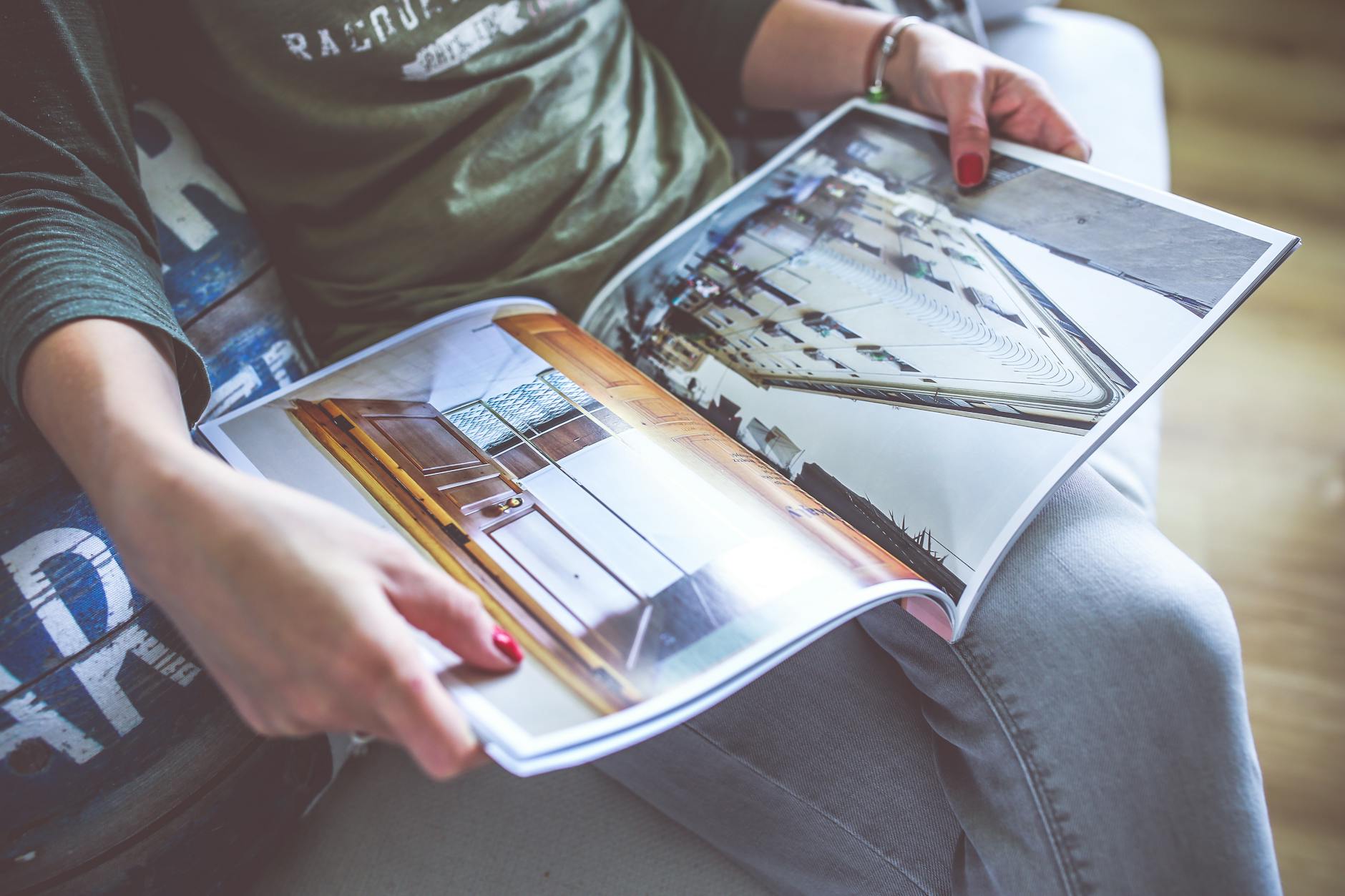
Images are typically the most visually dominant element in a magazine spread, and their placement is fundamental to the spread’s overall design. The most common approach is to use a dominant hero image—one large, high-impact photograph that takes up perhaps 60 to 70 percent of the available space, leaving the remaining area for text and supporting images. The hero image might span one full page or bleed across both pages for maximum impact. Smaller supporting images can be positioned alongside text or in the margins to add visual interest and break up dense paragraphs. A practical example: a food magazine article might feature a large, mouth-watering photograph of the finished dish taking up the right page, with the recipe and ingredient list on the left page, and smaller process photographs of key steps scattered throughout. Image resolution is critical in print—InDesign will allow you to place low-resolution images (72 DPI), but they will print poorly or not at all.
Professional print requires 300 DPI at the final printed size. This is a significant limitation that affects your workflow: if you need to scale an image larger than 100 percent, you may not have sufficient resolution. Always work with high-resolution source files, or be prepared to adjust your design if a low-res image cannot be enlarged. When placing images, use InDesign’s fitting options to either scale proportionally or to fill a frame while maintaining aspect ratio. Images should be cropped within the frame for design purposes, not outside the application in Photoshop, because this gives you the flexibility to adjust the crop later if the layout needs to change. The visual weight of images should also be balanced across the spread—if all the large imagery is on one page, the spread will feel unbalanced.

How Do You Establish Visual Hierarchy and Balance Across a Two-Page Spread?
Visual hierarchy in a magazine spread is about guiding the reader’s eye in a logical sequence and ensuring that the most important information is noticed first. Hierarchy is typically established through size, color, position, and contrast. The headline should be the largest and most prominent element, followed by the subheading and images, then body text, and finally captions or tertiary information. Position matters too—readers typically begin at the top left and follow a Z-pattern across the page, so placing key information in that zone ensures it gets noticed. The upper-left corner of the left page and the upper-right corner of the right page are prime real estate in magazine design. A comparison: web design prioritizes above-the-fold content because users scroll, whereas magazine design considers the entire two-page view as the primary composition unit.
Color usage dramatically affects hierarchy and balance. A well-chosen color palette—typically 3 to 4 primary colors plus neutrals—creates cohesion across the spread. Many magazines use color blocks or colored bars to accent sections, separate content, or draw attention to pull quotes or callouts. The limitation is that too much color becomes chaotic; reserved use of color is more effective than saturating the spread with every color available. Negative space (white space) is equally important—leaving areas of the spread uncluttered creates breathing room and actually makes the busy areas more visually powerful by contrast. Many beginner designers fear white space and fill every inch with content, but this creates visual fatigue. The rule of thirds can help with balance: imagine dividing your two-page spread into a 3×3 grid, and position your dominant elements along those lines or at their intersections for a naturally balanced composition.
What Common Technical Issues Arise When Designing Magazine Spreads, and How Do You Prevent Them?
One of the most frequent issues is improper setup of facing pages. InDesign allows you to work in single-page or facing-pages mode; facing-pages mode is essential for magazine design because it displays left and right pages together as they’ll be seen in print. If you accidentally work in single-page mode, your margins and positioning will be wrong. Another critical issue is overset text—text that’s too long to fit in the allocated frame. You’ll see a small red triangle or overflow indicator in the text frame. Rather than reducing font size or leading excessively (which degrades readability), the better approach is to edit the text to be more concise or to expand your text frames. Color mode is another technical requirement: print publications must be in CMYK color mode, not RGB. If you design in RGB and switch to CMYK during export, colors can shift unexpectedly.
Make this switch early and design in CMYK from the start to avoid surprises. Image linking is a frequent source of problems. InDesign doesn’t embed images by default; instead, it links to them. If you move or delete the original image file, your InDesign document will show a warning or missing-image indicator. Always package your final file (File > Package) which collects all linked images and fonts together, or embed images if you’re working with a small number of them. A warning about fonts: if you use fonts that your printer or the person receiving your file doesn’t have, the design will reflow when they open it. Always embed fonts in your PDF export, or confirm that your print vendor has the fonts you’ve used. Finally, the bleeding of full-color backgrounds or images at the edges requires planning. If your design extends to the bleed area, you must extend images or color all the way to the bleed marks, or you risk white edges showing at the finished trim.
How Should You Handle Text Wrapping and Runarounds for Magazine Layouts?
Text wrapping—the way text flows around images—is a fundamental tool for creating visually interesting spreads rather than simple one-column-text-next-to-image layouts. In InDesign, you place an image in a frame and then set the text wrapping option (Object > Text Wrapping) to have body text flow around it. The most common option is “wrap around bounding box,” which creates a rectangular boundary of space around the image, or “wrap around object shape,” which follows the actual contour of the image for a more refined, editorial look. A practical example: an article about photography might feature a portrait photograph with text wrapping around it, allowing the reader’s eye to move between reading text and viewing the image in a unified flow.
The offset value in text wrapping determines how much breathing room exists between the image edge and the text. An offset of 0.125″ to 0.25″ is typical and looks professional; too little offset and the text feels cramped against the image, too much and they feel disconnected. Be cautious with wrapping around object shape on photographs with complex edges—fine hair strands or intricate details can create awkward text wrapping that looks unintentional. In these cases, a simple bounding box wrap or even removing the image from the text frame and positioning it independently may be cleaner.
What Emerging Trends and Future Directions Should Magazine Designers Consider?
Magazine design is evolving as digital publications and interactive PDFs become more common. While print magazines remain relevant, many are now designed to exist in multiple formats—print, digital PDF, and web. This trend is pushing designers to think about responsive layouts that work whether viewed on a phone, tablet, or printed page. Some magazines now design their spreads with this in mind, using simpler layouts that scale well rather than complex multi-column designs that work only at specific sizes. This consideration affects your initial setup choices and asset preparation.
Additionally, variable fonts and dynamic typography are beginning to appear in high-end digital publications, allowing type to adapt to different viewing contexts. For print-only magazines, this isn’t yet relevant, but if your work might eventually be adapted to digital, being aware of these possibilities can prevent redesign work later. Sustainability is also becoming a concern in magazine design and production. Designers are increasingly aware of paper choices, ink efficiency, and print waste. Some publications are moving toward more minimalist designs that use less ink coverage, and color palettes are sometimes chosen with sustainable printing in mind. While this doesn’t change your InDesign workflow, it does affect decisions about bleeds, image sizes, and color density that you’ll consider during the design phase.
Conclusion
Designing a magazine spread in Adobe InDesign combines technical knowledge of the software with foundational design principles. The process begins with proper document setup—establishing the correct page size, margins, bleed area, and a consistent column grid that will guide all your design decisions. Typography, image placement, and visual hierarchy are the core elements that make a spread effective; you must think about how content flows across both pages simultaneously and ensure that the most important information guides the reader’s eye naturally. Consistent use of master pages, paragraph styles, and a disciplined approach to spacing creates professional results that don’t require last-minute scrambling.
Your next steps should be to define your specific publication’s requirements—page size, column count, and core typography styles—and establish a master page template before designing individual spreads. This investment in setup pays dividends when you’re designing multiple issues or training others to use your template. As you gain experience, you’ll develop a sense for balance and proportion that feels natural, and you’ll be able to push boundaries more creatively while maintaining readability and professional appearance. Study magazine spreads from publications you admire, pay attention to how they solve layout problems and use space, and apply those lessons to your own work.
Frequently Asked Questions
What is the difference between InDesign and other layout software like Canva or Figma for magazine design?
InDesign is industry-standard for professional print publication design because it’s built specifically for long-form layout work, supports CMYK color mode, handles print-specific features like bleeds and color separations, and manages linked images and fonts efficiently. Canva and Figma are simpler tools better suited for social media graphics or web layouts. If you’re designing for professional print, InDesign is the appropriate choice.
Can I design a magazine spread in InDesign and then adapt it for web or digital publication?
Yes, but with considerations. A print magazine designed at 8.5″ x 11″ in CMYK will need significant reworking for digital. Web requires RGB color, responsive layouts that work at different screen sizes, and shorter column widths. Some designers create separate versions for print and digital, while others design for print and then adapt by reflowing content into a web-friendly format, often using a web design tool afterward.
How do I ensure my InDesign files are ready for a professional printer?
Package your file (File > Package) to collect all images and fonts, verify that your document is in CMYK mode, confirm that images are 300 DPI at final print size, include bleeds on all images that extend to the page edge, and check with your printer for their specific requirements (ink density limits, color profile preferences, file format). Most printers provide a pre-flight checklist or template to ensure compatibility.
What’s the standard column count for a magazine spread?
There’s no single standard; it depends on content type and page width. Academic or news magazines often use 2 or 3 columns for readable text widths. Lifestyle and design magazines use 3 to 5 columns for more flexible layouts. The column count affects how large your images and text blocks can be, so choose based on the type of content you’ll be publishing and the readability requirements of your audience.
Should I design one page at a time or both pages of a spread together?
Always design both pages together in facing-pages view. The visual balance, image placement, and text flow across the gutter require seeing both pages simultaneously. Designing one page independently often results in imbalanced spreads that feel visually disconnected when viewed as a complete spread in print.
How much do I need to know about print technology and color management to design magazine spreads?
You don’t need to be an expert, but you should understand the basics: CMYK color mode, 300 DPI image resolution, bleed areas, and the limitations of your target printer’s equipment. Most printers are happy to explain their specifications and capabilities. Misunderstanding these basics is one of the main causes of disappointing print results, so a brief conversation with your printer before you start designing can save significant revision work.