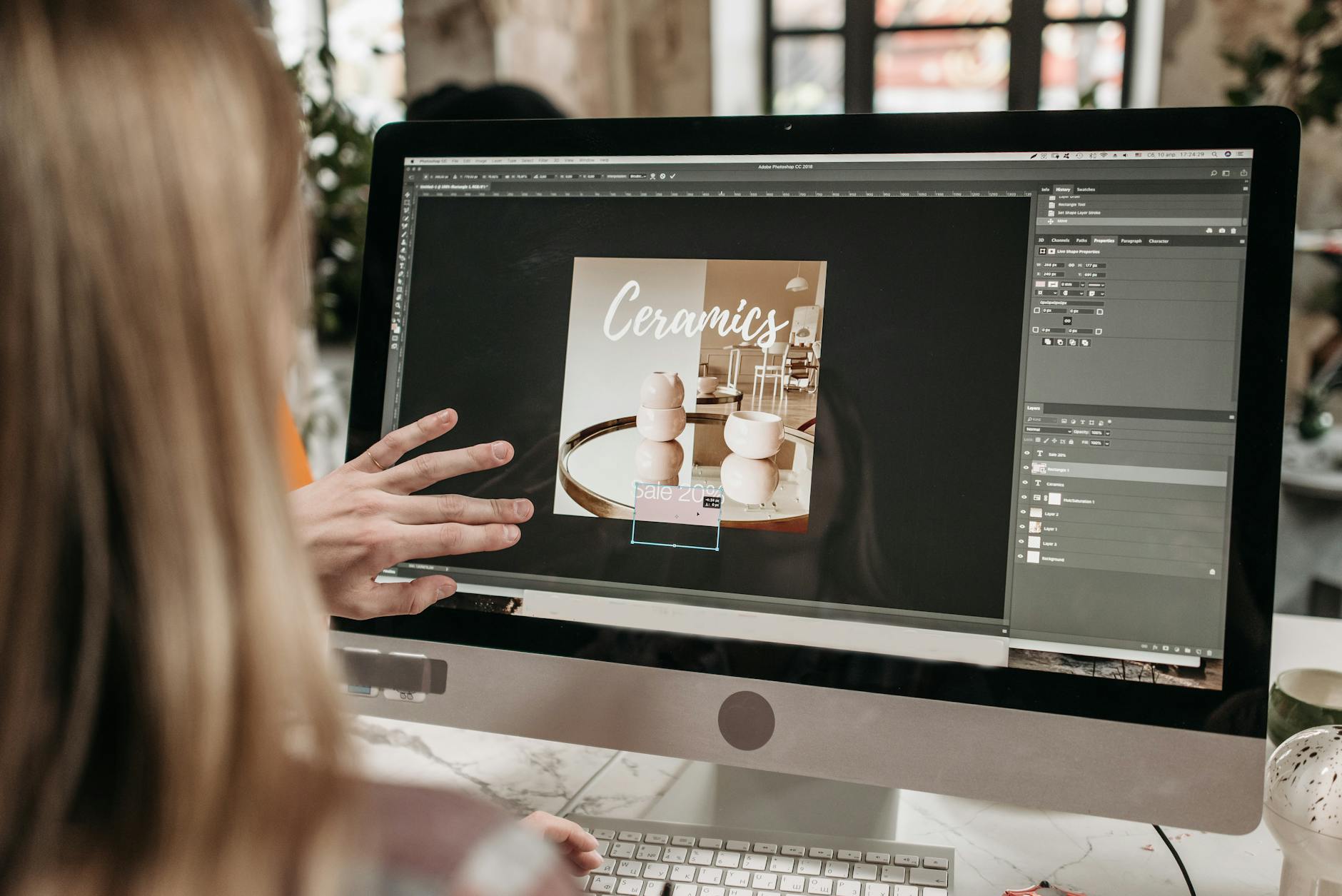
Adobe InDesign is a professional layout and design software that lets you create print-ready documents by controlling typography, images, colors, and spatial elements with precision that web design tools simply cannot match. Whether you’re designing a brochure, magazine, book, or any physical collateral, InDesign handles the technical requirements of print production—color profiles, bleed areas, resolution standards, and file formats—that separate a document that looks good on screen from one that actually prints correctly at a professional print shop. For example, a designer might create a beautiful poster in Photoshop, but when sent to print without proper color mode conversion or bleed settings, the result could be shifted colors, cut-off edges, or a completely different appearance than the digital file.
The fundamental difference between designing for print in InDesign versus designing for web is that print requires you to work in CMYK color mode, account for physical margins and bleed zones, and maintain resolution at 300 DPI rather than the 72 DPI typical of screen displays. InDesign is built from the ground up for these print requirements, whereas tools like Figma or Photoshop require you to manually configure these settings or work around their default screen-oriented assumptions. Understanding how to properly set up a document, manage colors, and prepare files for a print vendor is essential knowledge that prevents costly mistakes and ensures your designs meet professional standards.
Table of Contents
- What Are the Essential Document Setup Requirements for Print-Ready Designs in InDesign?
- How Do Color Profiles and Image Resolution Impact Print Quality?
- How Should You Manage Typography and Fonts for Professional Print Output?
- What’s the Proper Workflow for Creating Bleeds, Trim Marks, and Registration Marks?
- How Do You Handle Color Separations and Special Printing Techniques?
- What File Formats Should You Use When Exporting for Print?
- How Is InDesign Positioned in the Broader Design Tool Landscape as Print Tools Evolve?
- Conclusion
- Frequently Asked Questions
What Are the Essential Document Setup Requirements for Print-Ready Designs in InDesign?
When you create a new document in InDesign, the first critical step is to establish the correct dimensions, color mode, and bleed settings before you begin designing. You must set your document to CMYK color mode—not RGB—because printers work with CMYK inks, and converting from RGB to CMYK after design is complete often results in unexpected color shifts. Your document dimensions should match your final printed size exactly, such as 8.5 inches by 11 inches for a letter-size flyer or 6 inches by 9 inches for a book cover. Beyond the trim size, you need to define bleed—the extra space (typically 0.125 inches on all sides) that extends beyond your trim area to ensure that any full-color or edge elements print all the way to the edge without white borders appearing from minor cutting misalignments at the print shop.
InDesign also allows you to set up margins and columns during document creation, which establish guides for your content layout. Unlike margins in web design that control spacing in the browser, print margins represent the safe area where important content should reside, away from the binding edge or cut line. Guides in InDesign appear as non-printing blue or magenta lines that help you position elements consistently. For instance, if you’re designing a two-page magazine spread, you’d typically set a larger left margin on the left page and a larger right margin on the right page to account for the binding gutter in the center.

How Do Color Profiles and Image Resolution Impact Print Quality?
Color management in print is more complex than in web design because the CMYK colors you see on your monitor rarely match what comes off the press without proper profiling. Every printer uses a color profile—a mathematical description of how their specific equipment reproduces colors—and you should ask your print vendor for their recommended color profile (often named something like “US Sheetfed Coated v3”) and apply it to your document. If you place images in InDesign without considering their color space, you may see significant color shifts between your screen and the final print, such as a vibrant red photograph appearing muddy or a blue logo appearing purple. This is a common limitation of digital-to-print workflow: the screen cannot perfectly simulate what the printer will produce, so you must either trust your color profile settings or request a physical proof before full production.
Resolution is equally critical and often misunderstood by designers coming from web backgrounds. Print files must contain images at 300 DPI (dots per inch) at their final printed size; an image that looks sharp at 72 DPI on screen will appear pixelated and blurry when enlarged to print size. This means that a photo meant to fill a 6-inch by 4-inch area in a printed brochure needs to be at least 1800 by 1200 pixels in resolution. InDesign will let you place a 72 DPI image in a document, and the software will show it at full size on screen, but when you export to PDF or send to print, that low-resolution image will be revealed as a weakness in your final output. Always verify image resolution in InDesign’s Links panel, which shows you the effective DPI of each placed image at its current size and will warn you with an alert icon if resolution is insufficient.
How Should You Manage Typography and Fonts for Professional Print Output?
Typography in InDesign offers far more control than web browsers can provide, with features like kerning, tracking, leading, and baseline shift that let you refine the spacing and alignment of text at the character level. However, this power comes with a critical requirement: all fonts used in your document must be embedded in your exported PDF or packaged with your InDesign file when sending to a print vendor. If you use a font like Garamond and that font isn’t available on the printer’s computer, InDesign will substitute it with a default font, completely changing your design’s appearance. For example, a designer might carefully set headlines in a custom serif font for a luxury brand, only to have that font substituted with Times New Roman at the print shop because the file wasn’t properly packaged.
InDesign’s font management features help prevent this problem. You can check which fonts are used in your document through the Type menu, and when you package a file for delivery to a print vendor, InDesign will warn you if any fonts are missing or cannot be embedded (usually because of licensing restrictions). Best practice is to subset only the characters you actually use in your document, which reduces file size while maintaining design fidelity. Additionally, be aware that some fonts render differently at very small sizes—body text at 8 or 9 point size in a serif font like Garamond can become difficult to read if you add too much line spacing or use condensed letter spacing, so always print test layouts at actual size to verify legibility.

What’s the Proper Workflow for Creating Bleeds, Trim Marks, and Registration Marks?
Creating a document with proper bleed and trim marks is essential for communicating to the print vendor where the final cut should occur and ensuring full-coverage colors extend to the edge. When you set up your InDesign document, you specify both the trim size (your final dimensions) and the bleed amount (typically 0.125 inches extra). Any visual element that should extend to the edge of your final print—like a background color or full-bleed image—must extend into the bleed area, not stop at the trim line. If you design a flyer with a blue background that stops exactly at the trim line, the printer’s equipment will likely shift slightly during production, revealing white edges.
When exporting your document to PDF for print, InDesign can automatically include trim marks and registration marks in the output. Trim marks are small lines at the corners and edges showing the printer exactly where to cut, while registration marks are small targets that help align multiple color separations in offset printing. These marks sit outside the trim area and bleed zone, so they don’t appear on your final printed piece. However, not all print methods require these marks—digital printing, for instance, often doesn’t need them—so confirm your printer’s requirements before exporting. A common mistake is to export a PDF without selecting “Include Trim Marks” in the export dialog, then having the printer manually add them, which sometimes results in imprecise cuts or marks appearing in unexpected positions.
How Do You Handle Color Separations and Special Printing Techniques?
If you’re working with spot colors for a specialty print job—like a logo printed in a specific Pantone color, or a design that uses only two or three colors instead of full CMYK—you need to create and manage color separations in InDesign. A spot color is a premixed ink that’s more consistent and often more economical than building color from CMYK percentages. When you apply a spot color to text or shapes in InDesign, the software creates a separate color separation, which tells the printer to use that specific ink on its own printing plate. This is common in packaging design, brand materials, and budget-conscious print jobs where full-color CMYK printing would be expensive.
The warning here is that spot colors must be carefully managed during export. If you export to a standard CMYK PDF without specifying that a spot color should remain separate, InDesign will convert it to CMYK approximation, losing the consistency and visual impact of the actual spot color at the printer. Additionally, some specialty techniques like metallic inks, fluorescent colors, or varnishes require special handling and vendor communication that InDesign doesn’t automate. For example, if you want to add a glossy varnish to just the headline area of a brochure, you’d need to create a separate varnish plate or inform your vendor during the quoting process, because InDesign itself doesn’t have a varnish tool—it’s applied as a separate step after CMYK printing.

What File Formats Should You Use When Exporting for Print?
The standard export format for print is PDF, specifically PDF/X-1a or PDF/X-4, which are standardized formats designed to strip out screen-specific elements and preserve print-critical information like color profiles, bleeds, and trim marks. When you export from InDesign to PDF, you should use the “Print” preset rather than “Screen” or “Smallest File Size,” and you should verify that your export settings include the bleed area, maintain color spaces, and embed all fonts. A PDF/X-4 file is slightly more flexible than PDF/X-1a because it can preserve transparency and advanced effects, but both formats are widely accepted by professional print vendors.
Some designers make the mistake of exporting to formats like JPG or PNG for print, which are raster formats and cannot preserve the crisp vector text and graphics that InDesign produces. These formats also compress information in ways that degrade quality when printed large. If you’re working with a large print run or high-stakes design, ask your vendor whether they prefer PDF/X-1a or PDF/X-4, and always provide the original InDesign file as a backup in case the vendor needs to make last-minute adjustments.
How Is InDesign Positioned in the Broader Design Tool Landscape as Print Tools Evolve?
InDesign remains the industry standard for print design, used by professional designers, publishing houses, and print vendors worldwide, but the tool landscape is slowly shifting as more design workflows become hybrid—mixing print and digital output. Some designers use InDesign in combination with Adobe XD or Figma for iterative design work, then move to InDesign for final print production once layouts are locked.
Others use open-source alternatives like Scribus for simpler print jobs or to avoid subscription costs, though these tools generally lack InDesign’s refinement and vendor support. The future of print design may involve more direct integration between screen-based design tools and print vendors, but for now, InDesign’s deep print-specific features, color management capabilities, and industry adoption make it the proven choice for professional print-ready output.
Conclusion
Designing print-ready documents in Adobe InDesign requires understanding fundamentals that don’t exist in web design: CMYK color mode, 300 DPI resolution, bleed zones, trim marks, and proper font embedding. These aren’t optional niceties—they’re the technical backbone that separates a design that looks good on screen from one that actually prints correctly. By setting up your document properly from the start, managing colors with precision, and exporting to the correct PDF format, you avoid costly reprints, color shifts, and disappointed clients.
The investment in learning InDesign’s print-specific features pays dividends if you work with physical media or collaborate with print vendors. Even if you primarily design for web or digital screens, understanding how to prepare files for print makes you a more complete designer and opens doors to print design work. The next time you’re assigned a brochure, business card, or book cover project, remember that InDesign is purpose-built for these outputs, and the extra time spent on proper document setup and color management will result in professional-quality prints that match your vision.
Frequently Asked Questions
What’s the difference between trim size and bleed in InDesign?
Trim size is your final printed dimensions, while bleed is extra space beyond the trim size that accounts for cutting imprecision. Any visual element that should extend to the edge of your final print must extend into the bleed area.
Can I design in RGB in InDesign and convert to CMYK later?
Technically yes, but it’s risky. Converting RGB to CMYK after design is complete often results in unexpected color shifts. Always design in CMYK from the start if your output is print.
How do I know if my images have enough resolution for print?
Open the Links panel in InDesign. It shows the effective DPI of each placed image at its current size. Aim for 300 DPI at final printed size; anything below 240 DPI will likely appear pixelated.
What happens if I don’t embed fonts in my PDF before sending to a print vendor?
InDesign will substitute missing fonts with default fonts, completely changing your design’s appearance. Always embed fonts in your PDF export to ensure consistent output.
Do I need trim marks and registration marks on every print job?
No. Digital printing and simple jobs may not require them, but offset printing and professional work typically do. Always confirm your printer’s specific requirements before exporting.
Can I use InDesign for both print and web design?
InDesign is optimized for print. For web or digital output, tools like Figma, Adobe XD, or Webflow are more appropriate. You can export from InDesign to web formats, but they won’t match the quality of tools designed for screen output.