Using HTML and CSS together for email requires a fundamentally different approach than web design: you must write HTML code and inline all CSS directly into elements, avoiding external stylesheets and modern layout techniques entirely. Email clients—Gmail, Outlook, Apple Mail, and others—strip out `
Structuring HTML for Reliable Email Layouts
The foundation of email HTML is the table-based layout, which most developers learned to avoid in web design but is standard in email. Tables aren't semantically incorrect in email the way they are on the web—they're the only layout mechanism that works consistently across all clients. A typical email layout uses nested tables with inline styles to control width, padding, alignment, and background colors. For example, the outermost table might have a width of 600px (desktop email standard width, confirmed by Mailtrap and HubSpot), with an inline style like `
| `) with inline styles that control the column widths, padding, and backgrounds. If you want a two-column layout, you might have a row with two cells: ` | `.
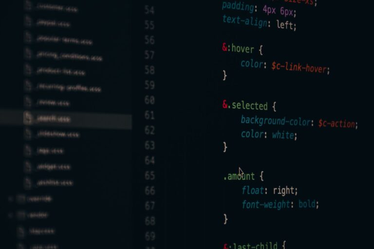
Every cell needs inline styles, and you avoid using colspan and rowspan because some clients render them unpredictably. This structure looks verbose and repetitive, especially if you're coming from modern web development, but it's reliable: it renders consistently in Gmail, Outlook, Apple Mail, and every other client that supports HTML email. One critical detail is that maximum email width should stay between 600-800 pixels, with 600px being the safe standard. Most desktop email clients display emails at 600px wide, and going wider creates horizontal scrolling on many devices. Digital Thrive and HubSpot's guides confirm that 600px is the optimal width for desktop readability. Mobile emails should adapt to approximately 320px wide on phones without media queries—use percentage widths on your table cells instead. So the same 50/50 two-column layout you built for desktop becomes 100% width on mobile through a mobile-specific stylesheet (using media queries in clients that support them) or by designing for mobile-first single-column layouts that work on both sizes.  Inline Style Syntax and Font Sizing Best PracticesWriting inline styles for email requires specific syntax that's more conservative than modern CSS. Font sizes should always use pixels, like `font-size: 16px`, not relative units like em or rem. Email clients don't respect the body font size the way web browsers do, so a font-size: 1.5em on an element might compute to something unexpected. Line-height is tricky: it should use unitless values like `line-height: 1.5` rather than pixel-based values like `line-height: 24px`. Mark A Plugin's 2026 HTML email best practices guide confirms this: unitless line-heights are more reliable because some email clients multiply the unitless value by the current font size, and the behavior differs when clients override font sizes. Colors should use hex codes (like `color: #333333`) rather than color names or RGB values, though most modern clients support all three. Background colors on table cells use `background-color: #f0f0f0`, not the shorthand `background` property. Padding and margins work in most clients with inline styles, but margins on text elements sometimes don't work reliably in Outlook—use padding inside table cells instead. Borders work with syntax like `border: 1px solid #cccccc`, but avoid border-radius because older Outlook versions don't support it. The comparison to web design is stark: on the web, you might write a CSS reset and then use cascading styles to apply consistent styling; in email, you repeat the same style attributes on every single element. You might have dozens of ` ` elements in a single template. This repetition is tedious, which is why email development tools and template builders automate the process by generating the inline styles from SCSS or CSS. If you're hand-coding email, accept that repetition is normal and necessary. File Size Limits and Performance ConsiderationsGmail clips emails larger than 102KB of HTML, displaying a "Message clipped" notice and hiding content behind a "Show trimmed content" link. This limit applies to the raw HTML size, not the rendered size or image data. Romualdo Bugai's Medium article on designing high-performance email layouts in 2026 emphasizes that staying under 100KB total HTML is important for Gmail compatibility. This constraint forces you to be ruthless about optimization: you can't include verbose comments, unnecessary attributes, or bloated tables. Common culprits that bloat email HTML are inline images in base64 encoding (which makes the HTML much larger), excessive table nesting (more tags means more bytes), and redundant styles (writing the same inline style repeatedly). The solution is to use external image hosting and reference images with ` For example, if you're repeating the style `font-size: 16px; color: #333333;` on twenty elements, consider if that style could be applied to a wrapping ` | ` instead, where nested text inherits the color. This reduces the total bytes significantly. A warning here: some email marketers try to hide content in zero-width or zero-height elements to stuff keywords, and some use display:none on content they want to hide from certain clients. Both techniques are risky. Email clients treat hidden content unpredictably, sometimes displaying it anyway or filtering emails that use these techniques as spam. If content shouldn't be visible, don't include it at all. If you need conditional content for different clients, use CSS media queries in clients that support them or send different email versions entirely.
 Testing and Mobile Responsiveness Without Media QueriesTesting email HTML is non-negotiable because you can't see how it renders without actually sending it to different clients. Tools like Mailtrap, Litmus, and Email on Acid preview emails in dozens of client environments, showing you exactly how your HTML renders in Gmail Web, Gmail Mobile, Outlook, Apple Mail, and others. You upload your HTML, and the tool shows side-by-side screenshots of how it appears in each client. This is where you discover that your background color looks inverted in dark mode, or that your carefully crafted media query works in iOS Mail but doesn't apply in Gmail's Android app. Mobile responsiveness in email typically means designing for 320px mobile and 600px desktop without relying on media queries (since Gmail Web doesn't support them). Use flexible table widths, scalable fonts that don't get smaller on mobile, and single-column layouts that work at both sizes. If you need different layouts for mobile, you can use CSS media queries as a progressive enhancement for clients that support them—users on Gmail Web won't see the mobile layout, but users on Apple Mail and Android Gmail will. The fallback design should still work reasonably at mobile width even without media queries applied. This is the tradeoff: you get a decent design for everyone (including Gmail Web users on mobile), or you invest more effort in media query techniques and accept that some clients fall back to the desktop layout. An example: if you have a two-column layout at 600px, you might stack columns with a media query like `@media (max-width: 600px) { td { width: 100% !important; display: block !important; } }`. This works in Apple Mail and most Gmail mobile apps, making columns stack to full width on mobile. But for Gmail Web and older Outlook, users see the two-column layout at 600px width, which is actually still readable on many mobile browsers because users can scroll horizontally. It's not ideal, but it degrades gracefully. Dark Mode and Modern Email Client FeaturesDark mode is now the default in Apple Mail, iOS Mail, and Outlook 2019+, which means a significant portion of your recipients will see emails in inverted colors unless you take action. Email clients automatically invert background colors and text colors, which can make your design look broken if you weren't expecting it. The solution is to test your email in dark mode (which Mailtrap and other tools do automatically) and sometimes use CSS to explicitly set colors for dark mode environments. Looking forward, email is slowly adopting features that web browsers have had for years. Some clients now support CSS media query `prefers-color-scheme: dark`, which lets you define separate styles for dark mode. Others support container queries or limited CSS Grid in experimental builds. However, Romualdo Bugai's 2026 guide on email design reminds us that adoption is fragmented: just because Gmail added a feature doesn't mean Outlook will, and just because Apple Mail supports it doesn't mean Yahoo Mail will. The future of email HTML is incremental improvement, not transformation. You can use new features as enhancements for clients that support them, but your baseline must always be inline styles and table-based layouts that work everywhere. ConclusionUsing HTML and CSS together for pixel-perfect emails means writing semantic HTML with every style inlined directly into elements, using table-based layouts for structure, and accepting that identical rendering across all clients is impossible. The constraints are real: Gmail clips emails over 102KB, Outlook doesn't support modern CSS, different clients support different features, and dark mode inverts colors automatically. Rather than fighting these limitations, successful email design works within them—building responsive layouts that degrade gracefully, testing in multiple email clients, and optimizing for the 70% of users opening emails on mobile devices. Start by defining your target width (600px for desktop), structuring your layout with nested tables and inline styles, and testing your HTML in a tool like Mailtrap or Email on Acid before sending to recipients. Build for the lowest common denominator in terms of CSS support, then use media queries and newer features as progressive enhancements for clients that support them. Understand that your email won't look identical everywhere, and that's not a failure—it's how email works. Document your inline styles, use a template builder to automate repetition, and focus on readability and clarity rather than pixel-perfect precision. You Might Also Like |