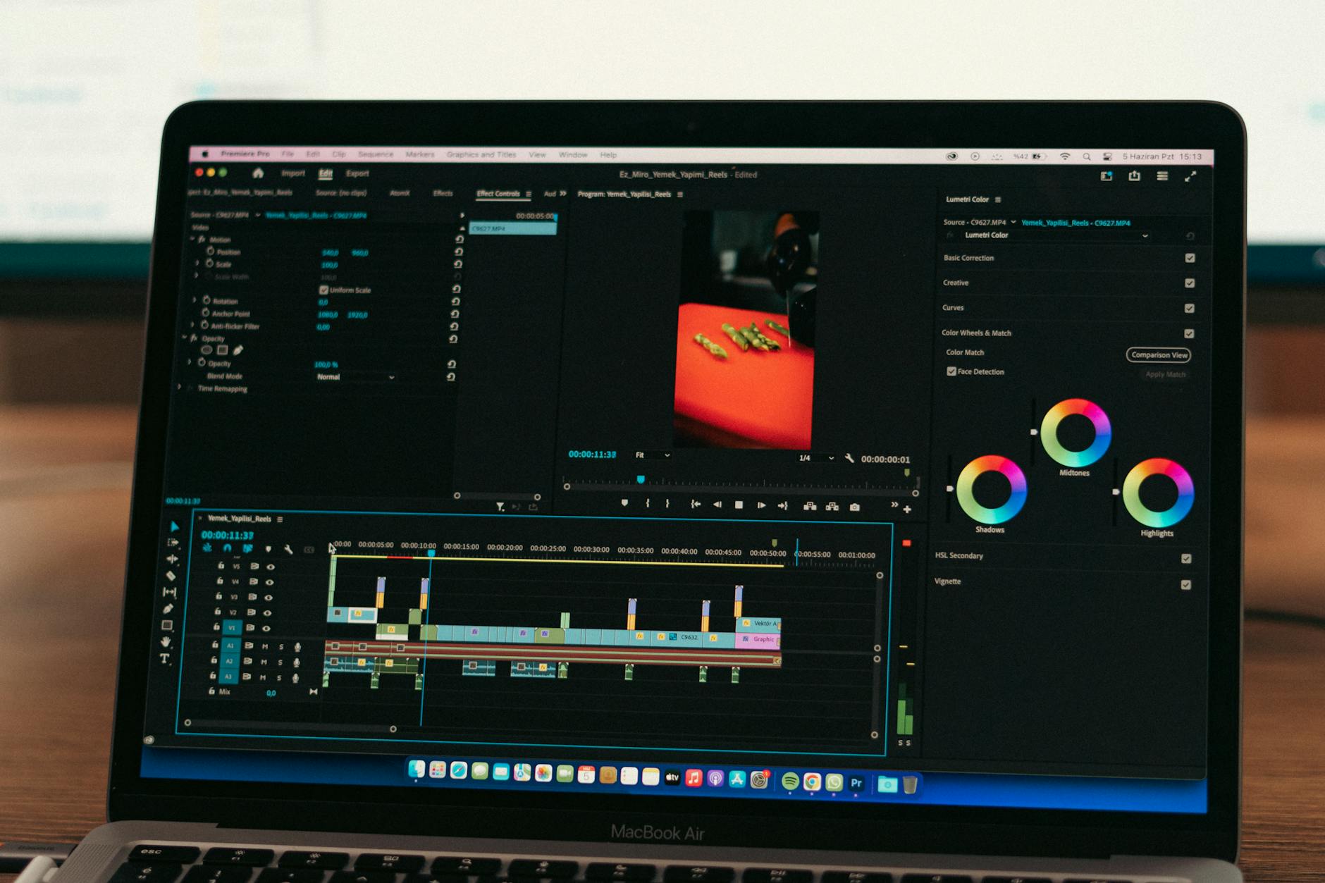
Color grading in Premiere Pro is the process of adjusting the colors, contrast, and tonal range of your video to achieve a specific look or mood. You can color grade professionally in Premiere Pro by using the Lumetri Color panel to apply curves adjustments, create LUTs (Look-Up Tables), and make precise HSL (Hue, Saturation, Lightness) corrections across individual shots or entire sequences. The software provides the essential tools to match footage from multiple cameras, correct color casts, and achieve a polished, cinematic finish without needing expensive third-party plugins.
Most video creators starting out assume they need specialized software like DaVinci Resolve for color work, but Premiere Pro’s Lumetri Color panel is sophisticated enough to handle professional-grade color correction and creative grading. For example, if you shoot an outdoor interview in harsh sunlight and want to bring down the highlights while lifting the shadows to create a flat, modern look, Premiere Pro can handle that workflow entirely within its interface. The key to professional color grading in Premiere Pro is understanding the difference between correction (fixing what’s wrong with the footage) and grading (applying a creative look). Most video professionals spend 60 to 70 percent of their color time on correction, ensuring consistent exposure and white balance across shots, then use the remaining time to apply signature color grades that distinguish their work.
Table of Contents
- What Are the Essential Color Grading Tools Available in Premiere Pro?
- Mastering Curves and Luminance Controls for Professional Results
- Using Hue, Saturation, and Lightness (HSL) Secondaries to Isolate Color Ranges
- Creating and Applying LUTs for Consistent, Repeatable Looks
- Common Color Grading Mistakes and How to Avoid Them
- Using Adjustment Layers and Dynamic Link for Efficient Workflows
- Color Grading Workflows for Different Content Types and the Future of Video Color
- Conclusion
- Frequently Asked Questions
What Are the Essential Color Grading Tools Available in Premiere Pro?
premiere pro offers several color tools, but the Lumetri Color panel is your main workspace for grading. Within Lumetri, you’ll find Basic Correction for exposure and white balance, Creative for applying LUTs and adjustments, Curves for precise tonal control, and HSL Secondary for isolating and adjusting specific color ranges. The Curves panel is arguably the most powerful tool because it lets you adjust individual color channels (red, green, blue) or the master luminance curve, giving you granular control over how shadows, midtones, and highlights respond to your adjustments. A practical example: imagine you’re color grading a wedding video shot under mixed indoor and outdoor lighting.
You would use the Basic Correction sliders to normalize white balance across clips, then use the Curves panel to push the blue channel slightly in the shadows to add richness, and pull the green channel in the highlights to reduce any yellow cast from the fluorescent indoor lights. This would be impossible to do effectively with just basic sliders. Premiere Pro also includes adjustment layers, which let you apply color corrections to a group of clips at once without having to adjust each shot individually. If you’ve shot an entire interview with consistent lighting, you can create an adjustment layer with your base grade and drop it above all interview footage. This saves hours on longer projects and ensures visual consistency.
Mastering Curves and Luminance Controls for Professional Results
The Curves tool is where most professional color grading happens, and learning to read and manipulate the curve is essential. A curve is a graph where the horizontal axis represents input levels (the original brightness of pixels in your footage) and the vertical axis represents output levels (where you’re pushing those pixels in your grade). When you lift a point in the curve upward, you’re making those tones brighter; when you push down, you’re making them darker. One limitation beginners encounter is over-grading with curves. If you adjust the curve too aggressively, you can create unnatural-looking transitions between tonal ranges and introduce color banding, where smooth gradients break into visible stripes of color.
A safer approach is to make smaller, intentional adjustments and toggle your adjustments on and off frequently to see the before-and-after. For example, if you’re darkening the shadows with the curve, reduce the adjustment by 20 percent from what feels right—you’ll achieve a more natural look. The luminance curve, which adjusts overall brightness across tonal ranges, should be your first stop before moving to individual color channels. If your footage is underexposed, lifting the luminance curve in the midtones and shadows first will often fix 80 percent of the problem. Only after you’ve corrected exposure should you move to color channels like reds, greens, and blues to fine-tune hue and saturation.
Using Hue, Saturation, and Lightness (HSL) Secondaries to Isolate Color Ranges
HSL Secondary controls in Lumetri allow you to select a specific color range (for instance, just the red tones in a sunset) and adjust only those colors without affecting the rest of the image. This is powerful for fixing problems and creating looks. You can reduce the saturation of a blown-out red dress in a scene without affecting the skin tones, or boost the saturation of blue sky while leaving clouds untouched. A specific example: you’re grading a product commercial where the brand color is a specific shade of blue. Using HSL Secondary, you isolate that blue range and slightly boost its saturation and lightness to make the product pop off the screen, then reduce the saturation of competing colors like reds in the background to keep viewer focus on the product.
Without HSL Secondary, this would require rotoscoping or creating masks frame by frame, which would take ten times longer. HSL Secondary has a learning curve because the hue range selector is sensitive. You might try to isolate orange tones and accidentally catch some yellow or red. The solution is to use the Range sliders (which expand or narrow the hue band you’re selecting) and the Softness slider (which feathers the edges of your selection) to fine-tune your isolation. Start with a narrow range and expand it gradually until you’ve captured the exact colors you want to adjust.
Creating and Applying LUTs for Consistent, Repeatable Looks
A LUT (Look-Up Table) is a preset file that translates input color values to output color values, allowing you to apply a consistent grade across multiple clips instantly. Premiere Pro lets you apply industry-standard LUTs (3D LUTs) from third-party vendors, or you can create your own custom LUT by building a grade in Lumetri and exporting it. Using LUTs saves time on projects with footage from multiple sources that needs a unified aesthetic. For comparison: without a LUT, grading a 30-minute documentary shot over three days with five different cameras might take 10 to 15 hours. With a LUT that you’ve designed for that specific set of cameras, you can apply the base grade to all footage in under an hour, then spend your remaining time fine-tuning individual scenes.
The tradeoff is that LUTs apply a fixed transformation, so they work best as a starting point, not a complete solution. You’ll almost always need to adjust individual clips after applying a LUT to account for variations in exposure and lighting. Creating your own LUTs is straightforward in Premiere Pro: build a grade you like in Lumetri, right-click on the adjustment, and export it as a 3D LUT file. You can then import that file into any project. Many color professionals maintain a library of LUTs for different scenarios—one for outdoor daytime, one for evening scenes, one for indoor tungsten lighting—and apply the relevant LUT as a base before fine-tuning.
Common Color Grading Mistakes and How to Avoid Them
One of the most common mistakes is grading on an uncalibrated monitor. If your display’s color profile is off, you might grade your footage to look good on your screen, but it will look oversaturated or undersaturated on other displays. Ideally, you should use a hardware-calibrated reference monitor, but if that’s not in your budget, ensure your display color profile is set correctly in your operating system and that your room lighting is consistent and neutral. Another pitfall is over-saturation. Beginners often boost saturation across the board thinking it makes footage look “better,” but real-world footage naturally has muted colors, and oversaturated video looks artificial and fatiguing to watch.
A warning: if you increase overall saturation by more than 10 to 15 percent, you’ll almost certainly need to dial it back. A safer workflow is to desaturate slightly in one color channel (like green) to add a cinematic feel, rather than increasing overall saturation. Color banding is also worth mentioning. If your source footage is 8-bit (which most DSLR and smartphone footage is), aggressive curve adjustments can introduce visible banding in gradients like sky or smooth backgrounds. If you notice banding after adjusting curves, reduce the intensity of the adjustment or add a tiny amount of noise to the footage to break up the bands. Premiere Pro’s Noise Reduction effect can paradoxically be used to add subtle noise—just invert the slider.
Using Adjustment Layers and Dynamic Link for Efficient Workflows
Adjustment layers sit above your footage and apply color corrections to everything beneath them, making them ideal for grading sequences or entire scenes with consistent lighting. Instead of copying and pasting the same grade to 50 clips, you create one adjustment layer with your desired look and place it above all 50 clips. If you later want to tweak that grade, you adjust it once on the adjustment layer, and the change ripples through all clips beneath it. A specific example: you’re editing a corporate training video with five 10-minute chapters. Each chapter was shot in the same conference room under the same lighting.
You color-correct the first chapter to look balanced and polished, then convert that correction to an adjustment layer. You drag that adjustment layer to sit above the entire timeline or above each chapter sequence, and suddenly chapters two through five have the same consistent look. If your client asks for the entire video to be slightly warmer, you adjust the adjustment layer once, and the change applies everywhere. Dynamic Link is another time-saver when you’re working with Premiere Pro and After Effects together. If you’ve built a complex grade in Premiere Pro and need to import it into After Effects for motion graphics work, Dynamic Link maintains a live connection between the two applications, so changes you make in Premiere update in After Effects automatically.
Color Grading Workflows for Different Content Types and the Future of Video Color
Different content types benefit from different color grading approaches. Documentary footage benefits from subtle correction that maintains realism and doesn’t distract from content. Narrative fiction often uses more dramatic grading to establish mood and tone. Commercial and product videos lean toward punchy, slightly oversaturated grades that make products look appealing.
Social media content often uses heavier contrast and saturation to stand out in feeds. Looking forward, AI-assisted color correction is becoming more prevalent. Premiere Pro is integrating Adobe’s Sensei AI to auto-suggest white balance corrections and other adjustments, reducing the manual work required for basic color correction. However, the creative grading phase—deciding what look you want to achieve and executing that vision—will likely remain a human skill. As color grading tools become more automated, the differentiation between professional colorists will come from creative vision and understanding how color affects viewer emotion and perception.
Conclusion
Professional color grading in Premiere Pro is achievable for any editor willing to learn the Lumetri Color panel’s tools and apply them systematically. Start by mastering basic correction—fixing exposure and white balance across your footage—then move into creative grading using curves and HSL secondaries to achieve a specific aesthetic. The most important takeaway is that color grading is both technical and artistic; you need to understand the mechanics of how curves and color channels work, but you also need to develop an eye for how color contributes to storytelling and viewer perception.
To improve your color grading skills, grade footage regularly, compare your results to professional work you admire, and invest time in understanding color theory. Watch your grades on multiple displays to ensure they translate across different screens. Start with subtle adjustments and build your grade incrementally rather than making large, dramatic changes that are hard to reverse or tone down. With consistent practice and attention to detail, you’ll develop the skills to color grade your own professional work without relying on expensive software or external colorists.
Frequently Asked Questions
What’s the difference between color correction and color grading?
Color correction is the process of fixing problems in footage—adjusting exposure, white balance, and contrast to make the image look technically correct. Color grading is the creative application of color to achieve a specific aesthetic or mood. Most professional color work involves both, with correction happening first to establish a solid baseline.
Can I color grade in Premiere Pro or should I use DaVinci Resolve?
Premiere Pro’s Lumetri Color panel is powerful enough for professional color grading. DaVinci Resolve is specialized software with some advanced tools that Premiere Pro doesn’t have, but for most commercial projects, Premiere Pro delivers professional results at a fraction of the cost and learning curve. Choose Premiere Pro if you’re already in the Adobe ecosystem; choose Resolve if color grading is your primary focus.
Do I need an expensive monitor to color grade professionally?
A calibrated reference monitor (typically $2,000 to $5,000) is the gold standard, but many professional colorists work on properly calibrated standard displays in controlled lighting environments. If you can’t invest in a reference monitor, ensure your display’s color profile is correct in your OS settings and avoid grading in rooms with dominant color casts from tungsten or fluorescent lighting.
How do I ensure color consistency across multiple clips shot in different lighting conditions?
Use adjustment layers as a base grade to unify the overall look, then adjust individual clips with the Lumetri panel to correct for their specific lighting conditions. Create LUTs for camera/lighting combinations you encounter frequently so you can apply a base grade quickly and focus on fine-tuning.
What is a LUT and why would I use one?
A LUT (Look-Up Table) is a file that applies a predefined color transformation to footage. You use LUTs to apply consistent grades across multiple clips quickly or to emulate the aesthetic of film stocks and professional cameras. LUTs are a starting point, not a complete solution—you’ll almost always need to adjust individual clips after applying a LUT.
How do I avoid color banding when grading?
Color banding typically appears in smooth gradients (like sky) when you make aggressive curve adjustments to 8-bit footage. To avoid it, make smaller curve adjustments or use an intermediate color space that supports higher bit depths. If banding does appear, you can add subtle noise to break it up or reduce the intensity of the problematic curve adjustment.