Adding transitions and motion graphics in Premiere Pro involves dragging preset effects onto clips, customizing timing and properties, or building custom animations from scratch using keyframes. The software offers a library of built-in transitions—from simple cuts and dissolves to complex 3D flips and morphs—that you can apply directly to the edit point between two clips. Motion graphics, the broader category, encompasses animated text, shape layers, and visual effects that help establish pacing, guide viewer attention, and elevate the production value of your content. Whether you’re cutting a short social media clip or a full-length documentary, understanding how to layer these elements transforms flat editing into dynamic visual storytelling.
Premiere Pro handles transitions and motion differently depending on your workflow. Transitions sit between clips and run in real-time (or near real-time, depending on your system), while motion graphics often live in After Effects or are created within Premiere itself using the essential graphics panel. For most editors, the practical workflow starts with placement—drop a transition onto a cut, adjust its duration, and preview. For motion graphics, you’ll either create keyframe animations directly in Premiere, import pre-built motion templates, or use After Effects compositions as dynamic layers. The difference matters because transitions are structural (part of the edit) while motion graphics are content (elements you’re adding to strengthen the visual narrative).
Table of Contents
- What Are the Core Transition Types Available in Premiere Pro?
- How to Apply and Customize Transitions in Premiere Pro
- Building Motion Graphics and Animated Text in Premiere Pro
- Using Motion Templates and Importing Pre-Built Assets
- Keyframe Animation and Common Motion Graphics Pitfalls
- Combining Transitions with Motion Graphics for Cohesive Storytelling
- Future Workflow Considerations and Industry Trends
- Conclusion
What Are the Core Transition Types Available in Premiere Pro?
premiere Pro ships with over 80 transition effects grouped into categories: dissolves, wipes, slides, zoom, 3D motion, and more specialized transitions. The dissolve is the industry standard—a simple, non-intrusive fade from one clip to the next—and it’s the default choice because it doesn’t distract from content. Wipes move a boundary across the frame to reveal the next clip, creating energy and visual interest. Slide transitions physically shift the outgoing clip offscreen while the incoming clip slides in, and these feel natural on action-oriented footage because they echo the motion already happening on screen. 3D transitions apply perspective and depth, turning a simple cut into a rotating card flip or a cube reveal, which works well for title sequences or interview montages.
The crucial limitation is that not all transitions suit all content. A grid explosion transition might look striking on a music video but absurd on a documentary interview. Transitions also require head and tail room—footage before and after the cut that doesn’t have other clips bleeding into it. If you try to apply a two-second transition but only have one second of black handle on either side, Premiere will either truncate the transition or slip the clips to make room (depending on your settings). This is why professional editors obsess about capturing clean head and tail: it ensures transitions can breath.

How to Apply and Customize Transitions in Premiere Pro
To apply a transition, navigate to the Transitions panel (Window > Transitions), locate the effect you want, and drag it onto the cut between two clips. Premiere places it at the default duration, usually 30 frames (one second at 24fps). The transition settings appear in the Effect Controls panel where you can adjust duration, alignment, and effect-specific parameters. For example, a wipe transition lets you change the angle and direction the wipe travels; a zoom transition lets you pick what zooms in and from where. This flexibility is one reason Premiere dominates in professional work—you’re not locked into canned animations.
One warning: transitions consume processing power, especially 3D motion transitions on longer sequences. If you have dozens of complex transitions on your timeline and your preview is sluggish, switch your program monitor to a lower resolution preview (1/4 or 1/8) until you render. Another common mistake is over-using transitions. Two seconds of fade, then a sudden cut, then a rapid-fire sequence of wipes reads as amateurish. Most professional cuts use dissolves for pacing and reserve flashy transitions for moments that genuinely need emphasis—scene changes, topic shifts, or comedic punctuation.
Building Motion Graphics and Animated Text in Premiere Pro
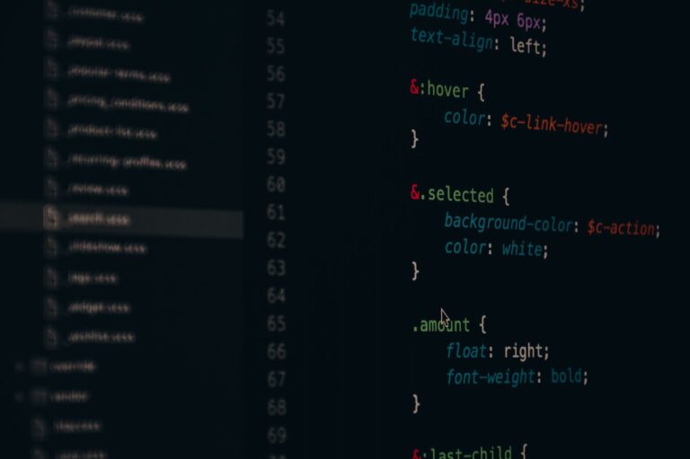
Motion graphics in Premiere start with the Essential Graphics panel, which lets you create text, shapes, and simple animations without leaving the program. Type some text, set a font and color, then use the Position, Scale, and Opacity properties to create keyframe animations. For example, you could have a title start off-screen, slide in over two seconds, hold for three seconds, then fade out. This is the motion graphics equivalent of a transition—it’s a visual element that communicates information while keeping the viewer engaged. The limitation is that Premiere’s motion capabilities pale against After Effects.
If you need complex layering, text on curved paths, or sophisticated 2D-to-3D transformations, you’ll import the composition from After Effects or build it there and send it back to Premiere as a nested sequence. For social media clips and web video, Premiere’s Essential Graphics often suffice. For broadcast, film, or high-end advertising, motion graphics usually originate in After Effects because the creative control is exponentially deeper. Many editors build rough versions in Premiere, gather client feedback, then polish in After Effects if approval comes through. That workflow avoids wasting time on After Effects work that might never ship.

Using Motion Templates and Importing Pre-Built Assets
Adobe provides Motion Graphics Templates (MOGRTs) that you can drag into your sequence and customize on the fly—change text, colors, and timing without opening After Effects. These live in the Essential Graphics panel and range from lower-third graphics to full title sequences. The benefit is speed: instead of building a professional-looking lower-third from scratch, you drop the template, type your name and title, and you’re done. For agencies and content creators producing dozens of videos weekly, templates are the difference between feasible and impossible. The trade-off is originality.
If everyone uses the same Adobe-provided template, your work starts to look generic. Smart teams use templates as a starting point—drop the MOGRT, modify the colors to match brand guidelines, adjust the timing to fit pacing, and suddenly it looks custom without the hours of design work. This comparative approach (template-as-starting-point versus building-from-scratch) lets freelancers bid competitively while maintaining visual quality. For corporate video work, where consistency matters more than distinctiveness, templates are an asset. For creative work where originality is part of the value proposition, they’re a foundation, not a finish line.
Keyframe Animation and Common Motion Graphics Pitfalls
Keyframing is the backbone of motion graphics in Premiere: set a property (position, scale, rotation, opacity) at a specific timecode, set a different value at a later timecode, and Premiere interpolates the change. A common mistake is using linear keyframes for everything. Linear motion is robotic—a text element moves at exactly the same speed throughout, with no acceleration. Real-world motion has easing: it starts slow, speeds up in the middle, and slows at the end. In Premiere’s Effect Controls, right-click a keyframe and select “Ease In” and “Ease Out” to apply these curves. The difference is subtle but crucial—eased motion reads as intentional and polished, while linear motion reads as rough or hastily made.
Another warning: don’t animate every property simultaneously unless you’re building something deliberately chaotic. Staggering animations—text position animates for half a second, then opacity fades in during that same window, then rotation kicks in at the tail end—creates visual complexity and keeps the composition readable. If position, scale, rotation, and opacity all move at once, the eye doesn’t know where to focus. Professional motion designers layer animations with intention. Additionally, overly long animations (five-second text slides, for instance) feel indulgent on web and social platforms where attention spans are compressed. Most effective on-screen text lives for 2-3 seconds. Longer durations work for broadcast or cinematic content where pacing is different.
Combining Transitions with Motion Graphics for Cohesive Storytelling
Transitions and motion graphics work best when they reinforce each other rather than compete. If you’re using a slide transition to move from one clip to the next, adding an animated text element that also slides in during that moment creates visual redundancy. Instead, use the transition to move the clips, then let the text appear static or enter via a different motion (fade in, scale up) that feels complementary rather than repetitive. This principle—visual consistency without repetition—separates professional work from novice sequences.
One concrete example: a documentary about wildlife migration could use a slow, subtle dissolve between animal shots, then layer animated text that scales up to reveal the next species name. The dissolve handles the visual transition between footage, and the text animation provides information without muddying the motion aesthetic. If you’d instead used a flashy wipe plus an animated text reveal, both happening simultaneously, viewers would feel bombarded. The layering approach respects the content while still deploying motion purposefully.
Future Workflow Considerations and Industry Trends
As AI-driven tools increasingly handle routine editing tasks, the craft of transitions and motion graphics is shifting toward personal voice. Algorithmic editors can match cuts and apply templates, but intentional motion design—where every transition and animation choice serves the narrative—remains a skill that differentiates professional work. Premiere Pro’s integration with After Effects continues to tighten; newer versions blur the line between the two applications, letting you edit and motion-design in a more unified workflow. Understanding both applications, and knowing when to stay in Premiere versus pushing complexity to After Effects, is increasingly valuable.
The broader trend in online video is toward simpler, faster transitions as attention demands increase. Broadcast television tolerates longer, more elaborate sequences; YouTube and TikTok audiences reward snappy cuts and minimal motion overhead. This doesn’t mean motion graphics are less important—it means they need to be faster, sharper, and more purposeful. Understanding these platform-specific expectations ensures your transitions and motion choices land correctly with their intended audience.
Conclusion
Transitions and motion graphics in Premiere Pro are powerful tools for pacing, visual storytelling, and viewer engagement. Transitions sit between clips and require head and tail room to function properly; the dissolve remains the professional standard because it’s non-intrusive. Motion graphics encompass animated text, shapes, and effects that you can build in Premiere using the Essential Graphics panel or import from After Effects for more complex work. The key discipline is restraint: use transitions and motion purposefully, ensure they complement rather than distract from content, and match the pacing to your platform and audience.
Start by mastering the fundamentals—applying dissolves, adjusting duration, understanding easing on keyframes—before reaching for flashy effects. Build a library of transitions that suit your style and your content’s tone. Test your sequences on the actual playback platform (phone screens for social, full monitors for broadcast) because motion that reads perfectly on a 27-inch display often feels too elaborate on mobile. From there, develop your personal approach: some editors rely on templates and minor customization; others treat every transition as a creative opportunity. Both approaches work; the difference is efficiency versus originality, and the right choice depends on your goals, deadlines, and audience expectations.