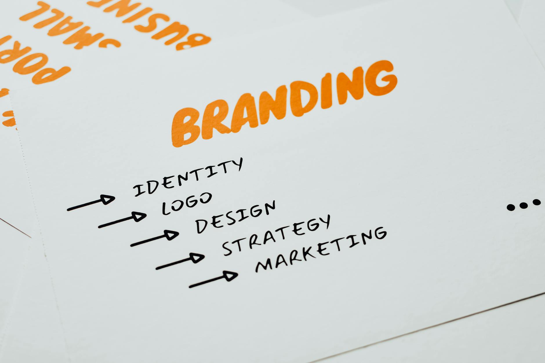
Designing a brand identity system in Adobe Illustrator involves creating a cohesive set of visual guidelines and reusable assets that establish consistency across all brand touchpoints—logos, color palettes, typography, icons, and patterns that work together as a unified whole. Rather than building individual assets in isolation, a systems approach means developing a modular framework where each element relates to others through intentional rules and proportional relationships.
For example, a fintech startup might develop a logo grid system that defines the minimum size ratios for the mark, establish a primary color palette tied to industry trust signals, and create a library of line-weight consistent icons that work at various scales, all built within Illustrator where you can document proportions, spacing, and scaling rules directly on artboards. The advantage of using Illustrator for this work is that it allows you to build vector-based systems that scale infinitely without quality loss—critical for brands that need to work from a favicon at 16 pixels to a billboard at 50 feet. By organizing your file structure thoughtfully, creating symbol libraries, using linked files, and documenting specs directly in Illustrator documents, you create a master reference that developers and designers can reference when implementing the brand across websites, apps, and print materials.
Table of Contents
- What Elements Should You Include in a Brand Identity System?
- Building a Modular Logo System with Constraint-Based Design
- Color System Design and Specification
- Creating a Scalable Icon System Built on a Grid
- Typography System Documentation and Implementation Challenges
- Building and Exporting a Symbol Library for Consistent Reuse
- Version Control and Governance for Long-Term System Management
- Conclusion
- Frequently Asked Questions
What Elements Should You Include in a Brand Identity System?
A complete brand identity system typically includes the core logo with its variations (full lockup, icon-only mark, horizontal and vertical versions), a defined color palette with primary and secondary colors specified in multiple formats (RGB, hex, CMYK, Pantone), a typography system that specifies font families, weights, sizes, and line heights, an icon system built to consistent grid and stroke rules, and pattern or texture assets that add visual richness. Many organizations also include photography style guidelines, illustration guidelines, or specific usage rules for imagery.
In practice, a midsize agency might document that their primary logo cannot be scaled smaller than 80 pixels in width on digital applications, that the secondary color must never be placed directly behind certain text colors due to contrast failures, and that icons must be built on a 24×24 or 32×32 grid with 2-pixel strokes. Illustrator accommodates this by allowing you to place guides, lock layers to prevent accidental modifications, and create multiple artboards showing each rule visually. A common limitation, however, is that Illustrator files can become unwieldy if you try to store all variations on a single document—many teams split their system into separate files organized by category (logos, colors, icons, typography) to keep file performance manageable and make version control easier.

Building a Modular Logo System with Constraint-Based Design
A modular logo system means creating a logo that can be deconstructed into smaller parts—a mark, a wordmark, an icon—each designed on a precise grid so they maintain proportional relationships. In Illustrator, you establish this by creating a visible grid (or guides) that controls the spacing and proportions of every element. For instance, a logo for a project management tool might have a mark built on a 64×64 pixel grid, with the wordmark positioned using the same grid units, so if a designer needs to resize the lockup for a business card, they can scale the entire system proportionally without redrawing anything.
Constraint-based design also means defining what can and cannot change. You might specify that the logo’s negative space is always preserved, that the mark can be used standalone only above a certain size, or that specific color combinations are off-limits. The limitation here is that maintaining these rules requires discipline and clear documentation—if multiple team members are adding to the system without alignment, the modular structure breaks down quickly. In Illustrator, you can use layers, groups, and color-coded guides to enforce these constraints visually, making it harder for someone to accidentally violate them.
Color System Design and Specification
A color system is more than just picking a primary and secondary color; it involves defining how colors interact, what accessibility standards they must meet, and how they translate across different media. In Illustrator, you build this by creating a swatch library where each color is named systematically—primary-blue, secondary-teal, neutral-gray-50, accent-red—and specifications document the RGB values for digital, CMYK for print, and hex codes for web development. A B2B software company might define primary-blue as RGB 25, 90, 180 / #195AB4, and also note that it meets WCAG AA contrast when placed on white text.
One practical challenge is that colors appear differently depending on the medium. A color that looks vibrant on a Mac display might appear dull on a Windows machine or when printed, and metallic or specialty inks add another layer of complexity. Many teams use color bridges—reference files that show color samples in multiple media side by side—to handle this. Additionally, if your brand uses a dynamic color palette with gradients or color transitions, you need to specify exactly which colors are being used in the gradient and at what percentages, so developers can reproduce the effect accurately in code.

Creating a Scalable Icon System Built on a Grid
An icon system requires establishing a grid—commonly 24×24, 32×32, or 48×48 pixels—that governs the proportions and spacing of every icon. In Illustrator, you set up this grid using guides and create icon artboards at your chosen size, then build every icon to the same stroke weight, corner radius, and padding rules. For example, a healthcare platform might use 24×24 icons with a 2-pixel stroke and 2-pixel padding from the edge, so the actual icon content lives in a 20×20 space.
Every icon—whether it’s a calendar, a user profile, a medication bottle—follows these rules, ensuring they look cohesive when displayed side by side. One major advantage of this approach is that it allows you to scale icons responsively for different contexts—the same icon system works at 24 pixels for a mobile interface and 48 pixels for a desktop view without losing clarity. The tradeoff is that the constraint can feel limiting when you’re designing certain icons; a detailed map icon might require more internal detail than your grid allows, forcing you to either stretch the constraint or simplify the icon. The warning here is that inconsistent stroke weights or padding will immediately stand out to users, breaking the perception of system coherence, so it’s worth auditing your completed icon set against the grid before releasing it.
Typography System Documentation and Implementation Challenges
A typography system specifies not just which fonts to use, but how they’re applied—heading sizes, line heights, letter spacing, and weight combinations. In Illustrator, you create a “type specimen” document showing how your chosen fonts (for instance, Inter for body text and GT Sectra for headlines) appear at different sizes and weights, and you document the exact pixel sizes and line heights that developers should use when implementing the design on the web. A SaaS dashboard might specify that H1 headings are 32 pixels at 1.2 line height using 600-weight Inter, while body text is 14 pixels at 1.5 line height using 400-weight Inter.
The implementation challenge arises when web font rendering differs from how fonts appear in Illustrator. Anti-aliasing, font hinting, and browser-specific rendering can make text appear slightly different, so you need to account for this by either providing fallback fonts or testing your typography system across browsers before finalizing specs. Another limitation is that web fonts have licensing restrictions and file sizes—you might love a font with 12 different weights, but loading all of them would slow down the website, so you often need to choose a subset of weights that provides enough visual hierarchy without performance cost.

Building and Exporting a Symbol Library for Consistent Reuse
In Illustrator, symbols are graphic elements that you can reuse multiple times, and any update to the master symbol propagates across all instances. This is powerful for a brand system because you can create a symbol library of logo variations, badge styles, or certified/approved badges that multiple team members can drag into their designs, ensuring consistency without requiring someone to manually recreate the element each time. You export this as a symbol library file (.ait) or as a CC Libraries asset, making it accessible across your Creative Suite.
The practical example is a financial services firm that creates a library of security badges and certification marks—each designed once, saved as a symbol, and reused in documents created by designers across multiple departments. Rather than each department creating its own version of the “ISO 27001 Certified” badge, everyone pulls from the same symbol, ensuring pixel-perfect consistency. The limitation is that symbols can become difficult to manage if your library grows too large without proper organization, and if you need to make variations of a symbol (like a color variant), you need to create separate symbols rather than simply recoloring the instance.
Version Control and Governance for Long-Term System Management
A brand identity system isn’t static—as your organization evolves, you may need to update colors, refine icons, or add new components. Managing these changes requires version control and clear governance about what constitutes a breaking change versus an enhancement.
Some teams use Git to version control their Illustrator files (though this can be cumbersome due to file size), while others use a shared drive structure with clearly named versions (Brand-System-v2.0.ai, Brand-System-v2.1.ai) and a changelog document explaining what changed between versions. Looking forward, many organizations are moving toward design system platforms like Figma or Zeplin that integrate with development workflows more seamlessly, but Illustrator remains valuable specifically for vector export precision and for teams already invested in the Creative Suite. The key is establishing a governance model early—who can update the system, how are changes reviewed and approved, and how are updates communicated to the entire organization—so the system remains trustworthy and actually gets used rather than becoming an outdated artifact that no one references.
Conclusion
Designing a brand identity system in Illustrator requires thinking systematically about modularity, constraints, and documentation from the start. By establishing a clear grid structure for logos and icons, specifying colors with precision, building a typography hierarchy, and creating organized symbol libraries, you create a reference that scales across digital, print, and physical applications while keeping your team aligned.
The next step after building your system is testing it in real-world contexts—apply your colors and typography to actual website mockups, display your icons in a real interface, and verify that your logo variations work at various sizes and on different backgrounds. Share your documented system with developers and stakeholders, incorporate their feedback about what’s missing or unclear, and establish a maintenance plan so the system evolves intentionally rather than drifting into inconsistency.
Frequently Asked Questions
What’s the difference between a brand style guide and a brand identity system?
A style guide is typically documentation about how to use brand assets (do’s and don’ts, spacing rules, color combinations). A brand identity system is the foundational set of assets themselves—the logos, colors, icons, typography—that you then document in a style guide. Think of the system as the toolkit and the guide as the instruction manual.
Should I use Illustrator or Figma for building a brand system?
Illustrator is superior for precision vector design and output, especially if you need to export to multiple formats or work with print-grade assets. Figma is better if your team is distributed and needs real-time collaboration or if you want easier handoff to web developers. Many teams use both—Illustrator for core design and Figma for documentation and developer specs.
How do I prevent my Illustrator file from becoming too large and slow?
Organize into multiple files by category (logos, icons, colors, typography). Use CC Libraries to share assets across files without storing everything in one document. Archive old versions. Use linked files rather than embedding large assets. Keep guides and hidden layers organized and delete unnecessary ones.
What export settings should I use when sharing assets with developers?
Export logos and icons as SVG files (vectors scale infinitely and are small file size), PNGs at 2x scale for raster fallbacks, and PDFs for print assets. Include specifications as a separate document noting exact sizes, colors (hex, RGB, CMYK), and usage rules. SVG is preferred for web because it’s vector-based and can be styled with CSS.
How do I ensure my color system works for accessibility?
Test all color combinations for WCAG contrast ratios using a tool like Contrast Ratio or WebAIM. Document which colors can be used together safely. Account for color-blind users by not relying solely on color to communicate information—use patterns, icons, or labels to reinforce meaning. Test your system with simulation tools to see how it appears to people with different types of color blindness.


